


Risk measures#
There’s an uncomfortable fact at the center of this page: the world’s most widely used risk metrics — volatility, Sharpe ratio, Information Ratio — are systematically generous to volatility selling strategies. Not slightly generous: spectacularly so. A well-built short vol strategy posts numbers no traditional manager can dream of, and those numbers are simultaneously true and misleading. Understanding why is the prerequisite for not falling in love with your own track record. I’ll proceed in layers: first the dispersion metrics, then the tail metrics, finally the operational ones.
Volatility: the blind queen#
The standard deviation of returns is finance’s default risk measure. It’s intuitive, additive over time (it scales with the square root of time, under independence assumptions), and it’s perfect for symmetric, well-behaved distributions. The problem is that it treats every deviation from the mean the same way: it doesn’t distinguish between a +3% month and a −3% month, and above all it doesn’t distinguish between a strategy that oscillates and one that accumulates small gains while waiting for a rare, violent loss. A strategy that collects 0.4% a month for 59 months and loses 20% in the sixtieth has a tiny volatility measured on the first 59 — and a true distribution that volatility cannot see, because all the relevant information sits in an event the sample contains once or not at all.
Higher moments help, but less than people think. The skewness of a short vol strategy is strongly negative on daily returns — the signature of the “picking up pennies in front of a steamroller” profile. Kurtosis measures the weight of the tails. But beware of skewness fetishism, and here I borrow the most instructive example I know (the source is on the Resources page): consider a bet that with 99% probability returns +1% and with 1% probability returns X. For X = +0.9%, X = 0%, X = −10%, X = −50%: the skewness is identical in every case, because it’s a dimensionless measure, normalized by the cubed standard deviation. A wonderful bet and a ruinous one can have exactly the same skewness. Moral: skewness alone does not rank risks; it must always be read together with the scale of the losses. “Avoid negative skewness” is empty advice; “cap the maximum loss at a survivable level” is operational advice.
Sharpe and Information Ratio: the dangerous charm of the denominator#
The Sharpe ratio (excess return over the risk-free rate, divided by volatility) and the Information Ratio (excess return over a benchmark, divided by tracking error) are the same construction with different reference points; if the benchmark is cash, they coincide. For an overlay strategy like the ones on this site, the natural benchmark is the underlying portfolio, so the right metric is the IR: it measures alpha per unit of active risk added. The reference scales from the asset management industry (Grinold and Kahn): 0.5 is a good active manager, 1.0 is excellent and rare, the long-run Sharpe of equities is 0.3-0.35.
Now the numbers of the trade: the TRPS reference track record reports an IR of 3+ since 2018 and 9-10 over recent years; Bates measures Sharpe ratios of 2.8-3.7 times the market on delta-hedged put selling from 1988 to 2017. Off-the-charts numbers. Are they fake? No: they are correctly computed on a distribution the denominator can’t read. The mechanism is the one above: if the strategy’s characteristic loss is rare, then in samples where it doesn’t show up, measured volatility is minuscule and the ratio explodes. An IR of 9 over three years without a losing month doesn’t say the risk has disappeared; it says the risk didn’t materialize in the measured period. There’s also a sampling trap: the annualized IR depends on the measurement frequency (monthly × √12), and for strategies with concentrated losses the choice of window can change the result by multiples. I use the IR, and I’ll use it in the Strategies section — but always paired with a tail measure, never alone. When you see a double-digit IR, the right question is not “how good is he?” but “how much does he lose in the scenario that hasn’t happened yet?”.
VaR and CVaR: looking into the tail#
Value at Risk answers: what is the maximum loss that will not be exceeded with 95% (or 99%) probability over a given horizon? It’s a quantile of the loss distribution. Useful as a common language and as an operational limit, it nevertheless has a serious conceptual flaw for a seller of tails: it is blind beyond the threshold. Two strategies with the same 99% VaR can lose, in the worst 1% of cases, 5% for one and 100% for the other. For an option seller, where all the action lives beyond the quantile, VaR is almost a provocation. Let me add its twin sin, which afflicts every metric estimated from data: backtest overfitting. A short vol strategy optimized on the past will always look splendid, because its parameters will have adapted precisely to the tail episodes in the sample — dodging, by construction, the historical crashes and no others. I distrust backtests with Sharpe ratios above 2 and “magic” parameters, and I trust simple, conditional rules I can explain out loud.
The correction is CVaR (Conditional VaR, or Expected Shortfall): the average loss conditional on having ended up beyond the threshold. It answers the right question — “when things go badly, how badly do they go on average?” — and it’s the measure banking regulators adopted precisely because of VaR’s flaws. Estimating it, however, requires tails, and tails are scarce in historical data by definition: the empirical CVaR of a short vol strategy computed over five quiet years is worth little. Better to estimate it structurally: given my options portfolio, how much does it lose if the index opens down 10%? Down 15%? With IV at 60? This can be computed with certainty from the portfolio’s composition, with no need for the scenario to have ever occurred.
Stress-test loss and STAR: Israelov’s lesson#
This is exactly the approach of the Israelov paper on which the DHCS strategy is built (see the DHCS page), and I’m previewing it here because it’s the most important methodological contribution on the entire site. Israelov evaluates every sellable option on the SPX surface with three yardsticks: the volatility of returns, the stress-test loss (the position’s expected loss in an extreme index scenario) and CVaR. He then builds two return/risk ratios: alpha divided by volatility (which he calls the Volatility Appraisal Ratio, conceptually an IR) and alpha divided by the stress-test loss, the STAR (Stress-Test Appraisal Ratio).
The result flips the rankings, and it deserves the numbers. Measured by IR, the deep OTM put (−2.5 standard deviations) is the best on the surface: a ratio of 2.5 versus 0.7 for the ATM. Measured by STAR, it’s among the worst: to match the ATM’s alpha it must be levered up, and levered up it carries nearly twice the stress loss (19.5% versus 10.3%) — 3.4 times the ATM’s IR, but only 0.6 times its STAR. The same position is the most attractive or among the least attractive on the board depending on the yardstick. It’s not a paradox: it’s the quantitative demonstration that for asymmetric payoffs the choice of risk measure is not a technical detail but the decision.
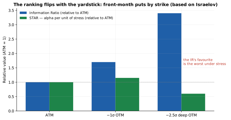
The same surface, two opposite rankings: the deep OTM dominates by Information Ratio and is the worst by alpha per unit of stress. Based on Israelov’s results. And note the corollary you’ll meet again in sizing: under a stress-test loss constraint, the achievable alpha scales linearly with the extreme-loss budget you accept — return is bought in tail currency, at a known rate.
The operational metrics: drawdown, PCR and conditional measures#
I’ll close with three tools from the practical drawer. The maximum drawdown (the largest peak-to-trough loss) is the most honest metric for anyone living off their own account: it incorporates the sequence, not just the distribution, and it maps directly onto the existential question “at what point would I quit, or be forced to?”. The TRPS’s premium capture rate (PCR) — the share of gross premium collected that remains net after losses and stops — is a process metric specific to the trade: a PCR of 94% on the 1DTEs (the 2025 number from the reference track record) says a lot about underwriting quality, even if nothing about the tail. Finally, the conditional measures: the matrix crossing the worst daily S&P 500 declines with the VIX level of the previous day is a perfect example — the risk of this trade is not a constant but a function of the regime, and measuring it without conditioning on the regime is like quoting an insurance policy without looking at the zip code.
The page’s takeaway is a composition rule: one path metric (IR or Sharpe) to judge the quality of the process, one tail metric (stress-test loss or structural CVaR) to size the position, and drawdown for the final verdict. Anyone who shows you only the first of the three is showing you the top side of a rug with something underneath.
In practice, the rule becomes a weekly dashboard of five numbers, which I describe because it’s what I actually look at: (1) the options portfolio’s loss in the −15% overnight scenario with IV doubled, recomputed on the current composition — the number that governs leverage; (2) stressed margin relative to available cash; (3) the year’s cumulative PCR by leg; (4) the current IV−RV spread, the thermometer of the edge (see the Volatility risk premium page); (5) the year-to-date drawdown against the annual budget I’ve set myself. Five numbers, ten minutes, no exotic models: the sophistication of risk management lies not in the mathematics of the measures but in the discipline of looking at them when everything is going well — because when things go badly, it’s too late to start. What exactly is under the rug — what market tails really look like, how often and with how much warning they arrive — is the subject of the next page.